The process
1. Discover
1.1 Desk research
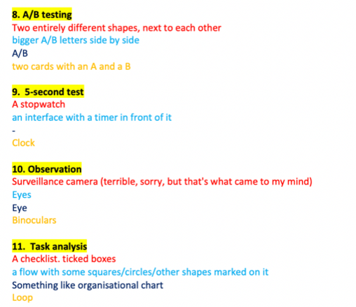
I began the project with extensive desk research—diving into UX research books and articles recommended by my mentor and colleagues. This foundational reading gave me the confidence to draft a Word document summarizing a curated list of research methods.
Ultimately, this document became the basis for the content in the final tool.
1.2 User research
To understand user expectations and needs, I conducted interviews with five of my colleagues. The goal was to:
- Assess their opinion of the content in the Word document
- Understand how they envisioned the tool
- Gather practical suggestions for improvement
I chose interviews because they allowed me to quickly empathize with users and ask follow-up questions to clarify their thoughts.
2. Define
Insights from the interviews helped me define clear design requirements:
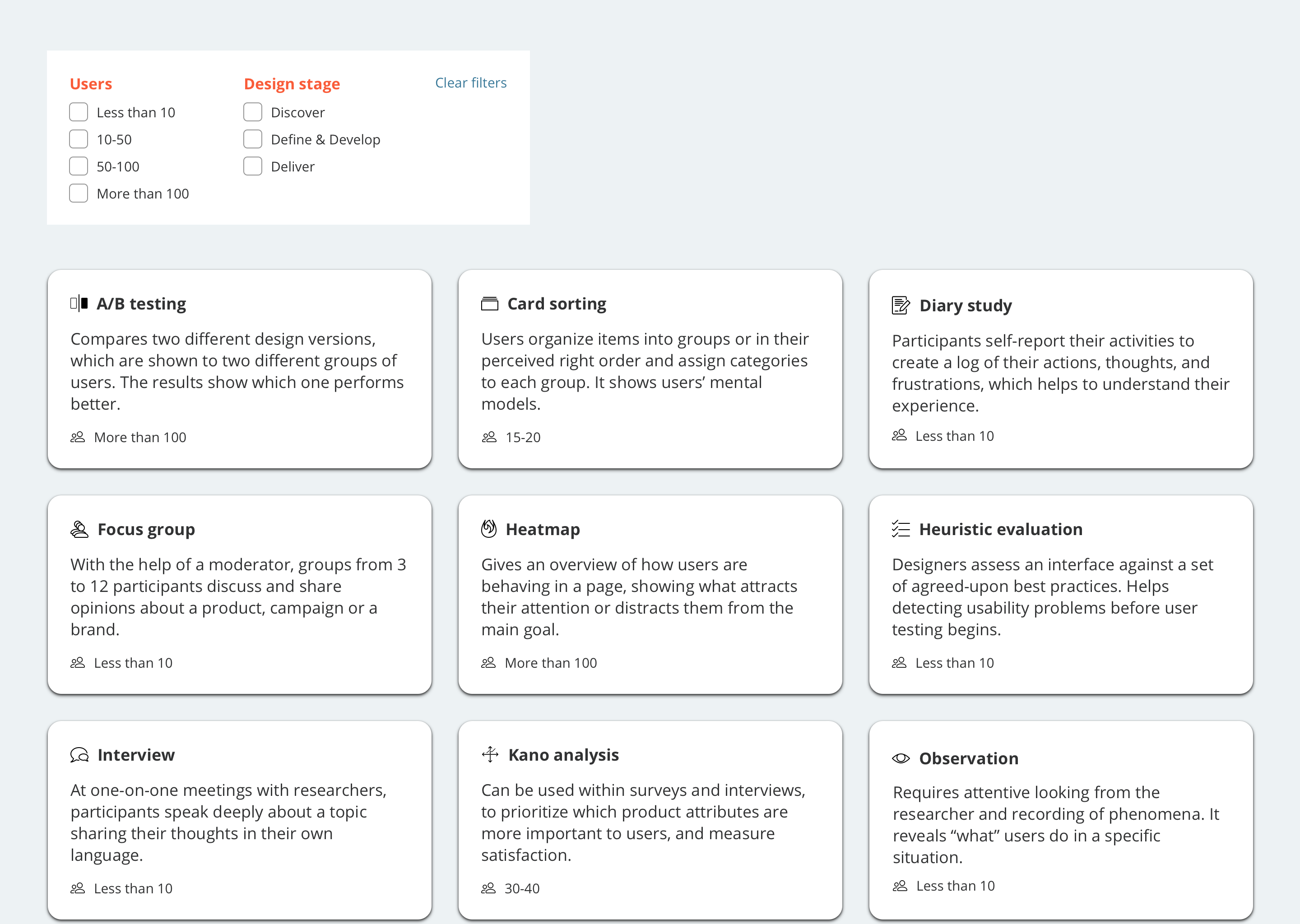
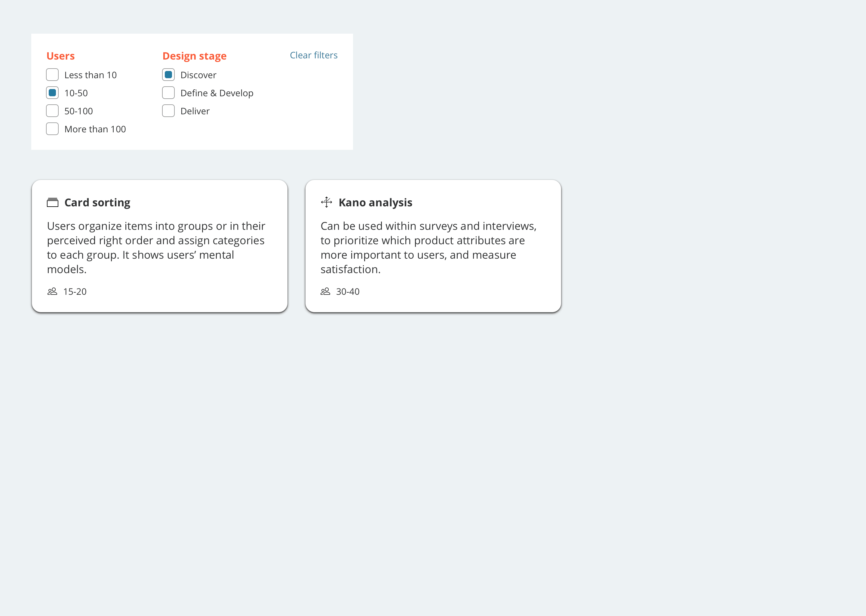
- A filtering system to quickly find the right methods
- Visuals aligned with the company’s brand style
- Aesthetic appeal
- Minimal text for ease of understanding
- Interactive interface
- Easy maintenance and content updates
- Have an overview that helps comparing the methods
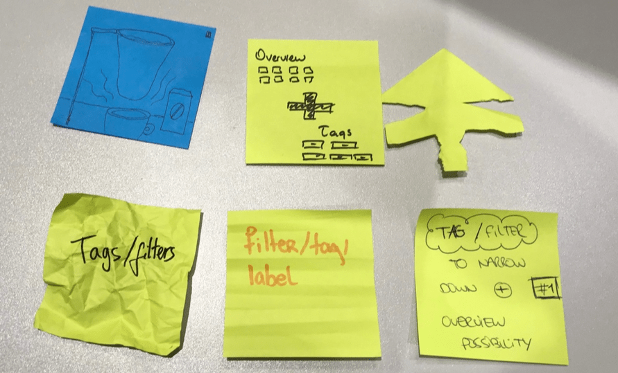
3. Ideate
I started ideating with solo brainstorming, a technique I’ve always found effective.
For the ideation, I decided to do individual brainstorming, since this is a technique that always gave me good results, and I felt comfortable using it.
To select the final direction, I hosted a feedback session where colleagues used sticky notes to vote for their favorite ideas. Concepts involving classic filtering and tags were the most popular. I chose the classic filtering approach as it aligned best with Studyportals’s existing UX.