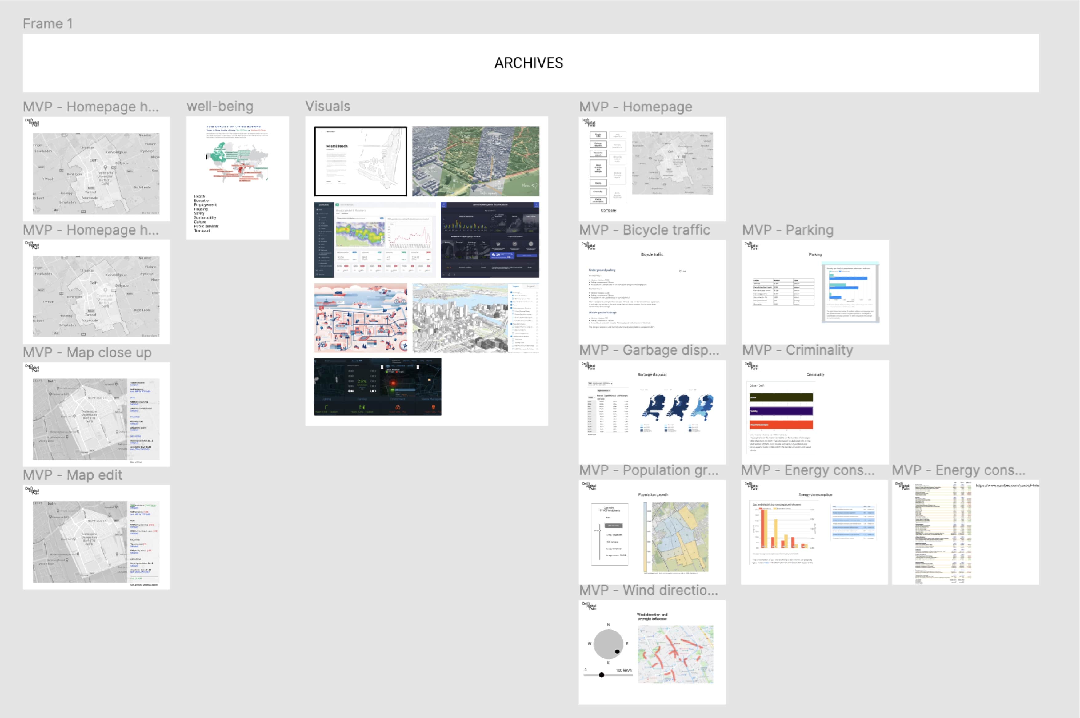
The process
Sprint 1
During the first sprint, we did desk research on existing digital twins and multiple topics (such as energy consumption, criminality, garbage etc.). We also prepared questions for our first meeting with the clients to find out their expectations and needs.
At the end of each sprint we had a demo with the clients. In this demo we showed the clients the most important insights we gathered from the initial desk research.
We used Figma for the demo presentation to the clients.
After obtaining feedback from the clients, we decided to make our digital twin about road traffic.
Sprint 2
Once we had a clearer vision on our product, we started designing mobile wireframes.

Mobile wireframes.
However, after the feedback from our clients, we had to change the design to a desktop version.
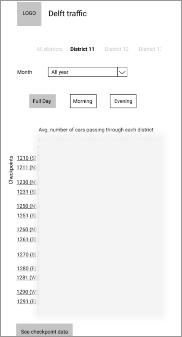
Initial design for desktop.
At the demo with the clients, we got some valuable feedback:
- Numbers aren’t a problem for the clients.
- Add rush hours (morning 7-9am and evening 4-7pm).
- Take into account the two sides of the street.
- Test the product more with our users, so we get enough useful feedback.
- Add more interactivity to the digital twin.
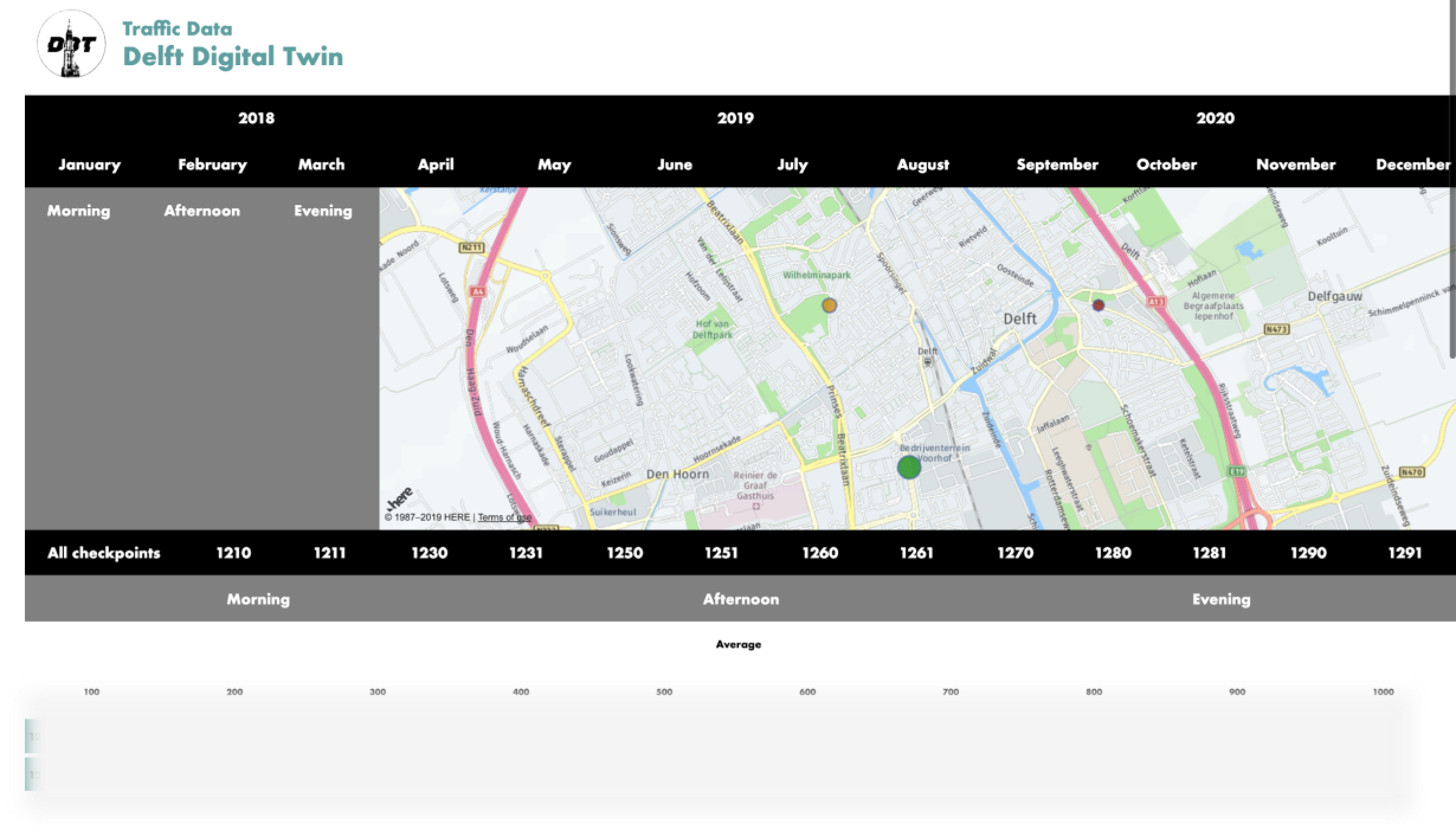
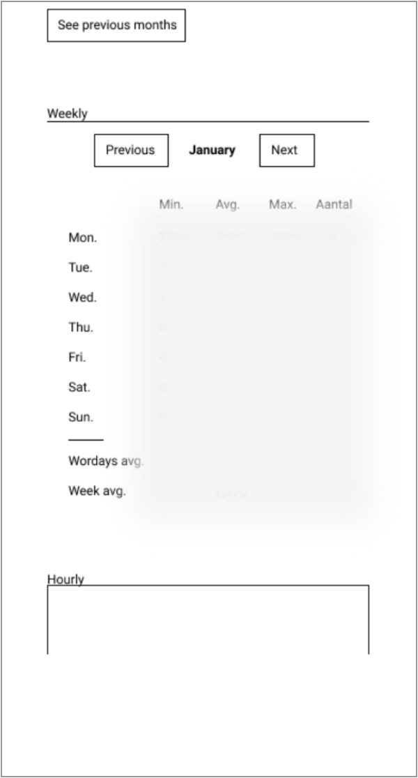
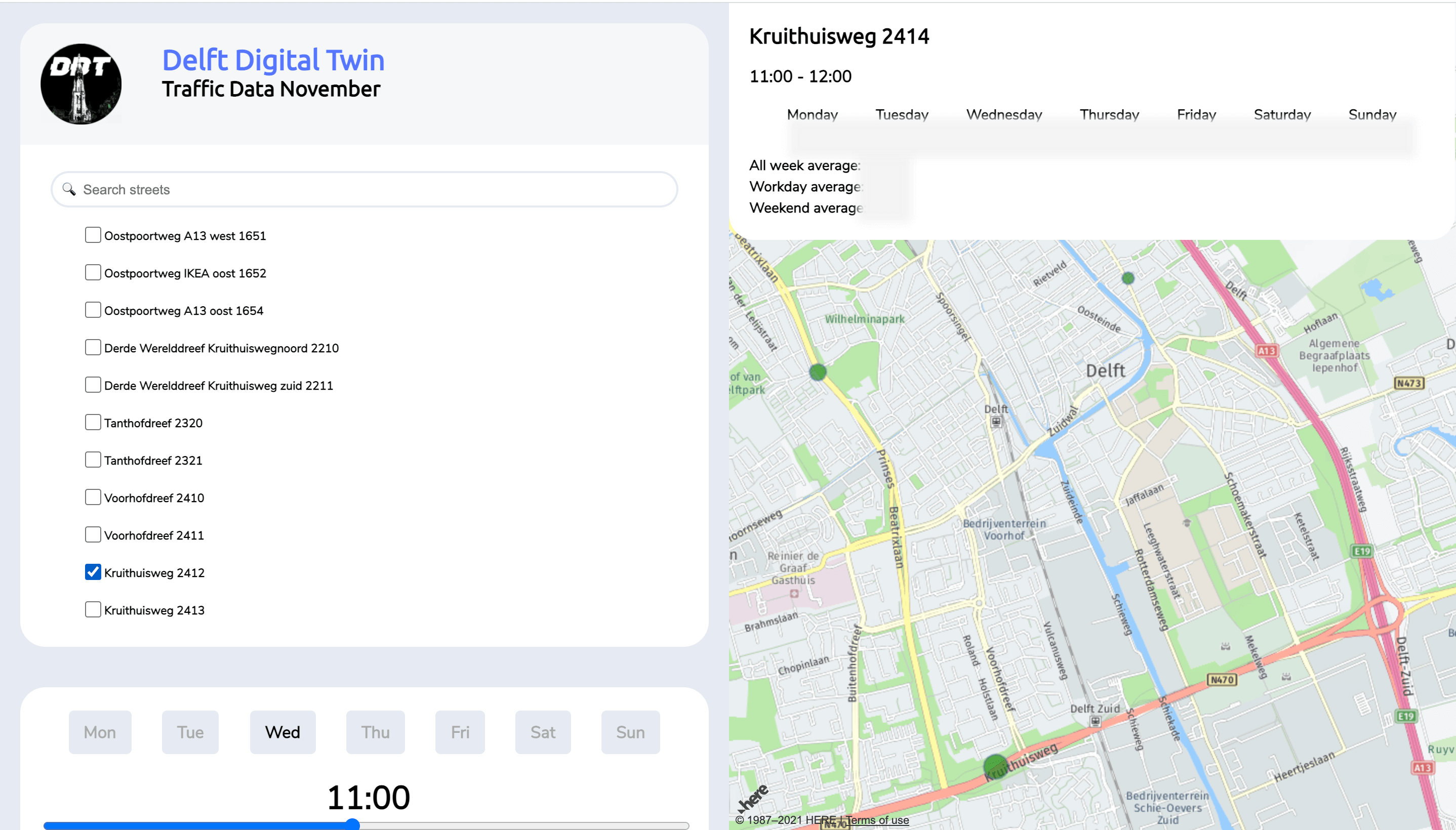
Live working website presented during the demo.
Sprint 3
Once the third and final sprint started, we prepared a list with questions for our meeting with one of the clients.
From the meeting we got the following insights:
- The current heatmap is very good.
- Add a graph line for each data point.
- Include the number of cars that pass hourly for heatmap points and flow through the city.
Hotjar
Since we couldn’t meet the clients face-to-face, we had to set up Hotjar in our website to get feedback on our product.
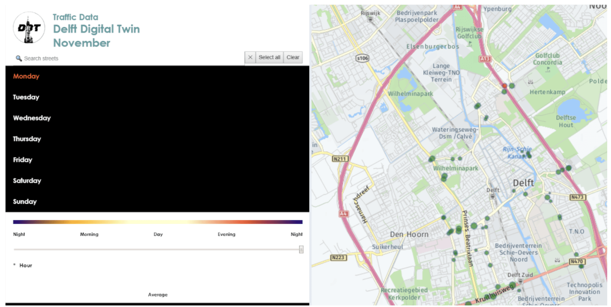
Website we tested with Hotjar.
We created a poll and collected responses from our clients but also from our lecturers to have enough insights.
Feedback gathered from the Hotjar poll:
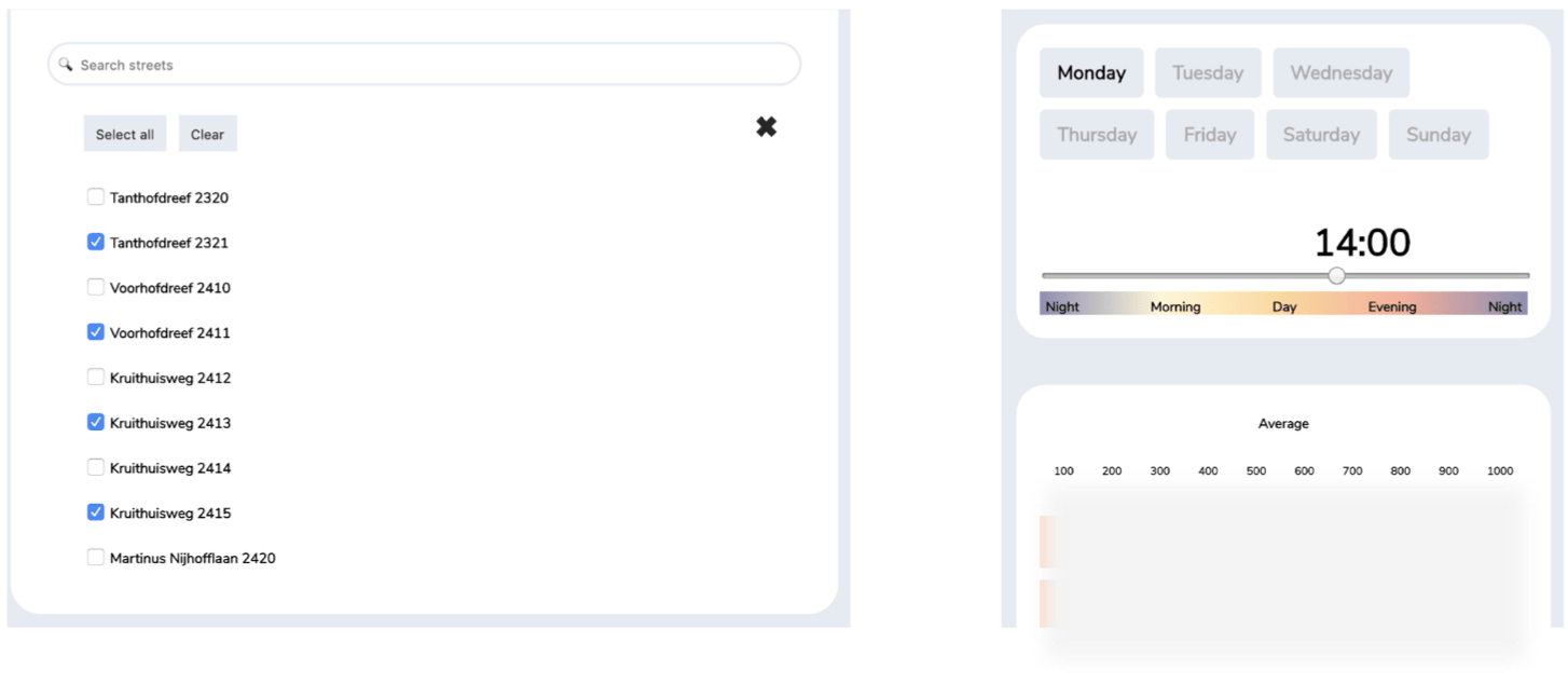
- Add exact value of the checkpoint and street names on the graph.
- Have a legend to get a better understanding of what the annotations on the graph mean.
- Better pop up when pressing on a checkpoint.
- Titles to better understand the graph (average cars).
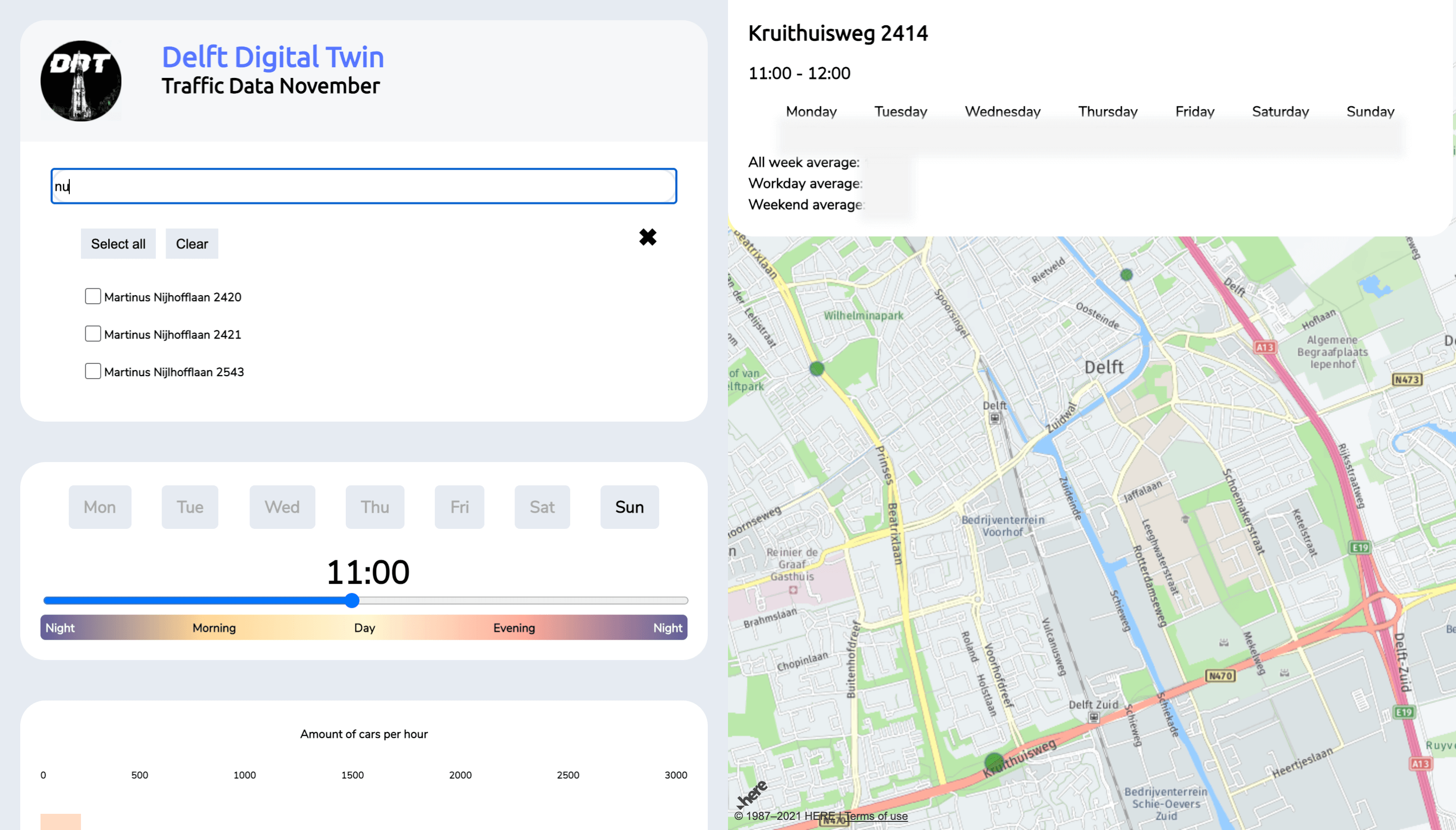
- Improving selection and deselection of the streets on the search bar.
Heatmap findings:
- The first thing the majority of users do once in the platform is clicking through the scroll bar.
- The searchbar is the most used feature.
- 78.6% of the users scrolled down to the first half of the page.

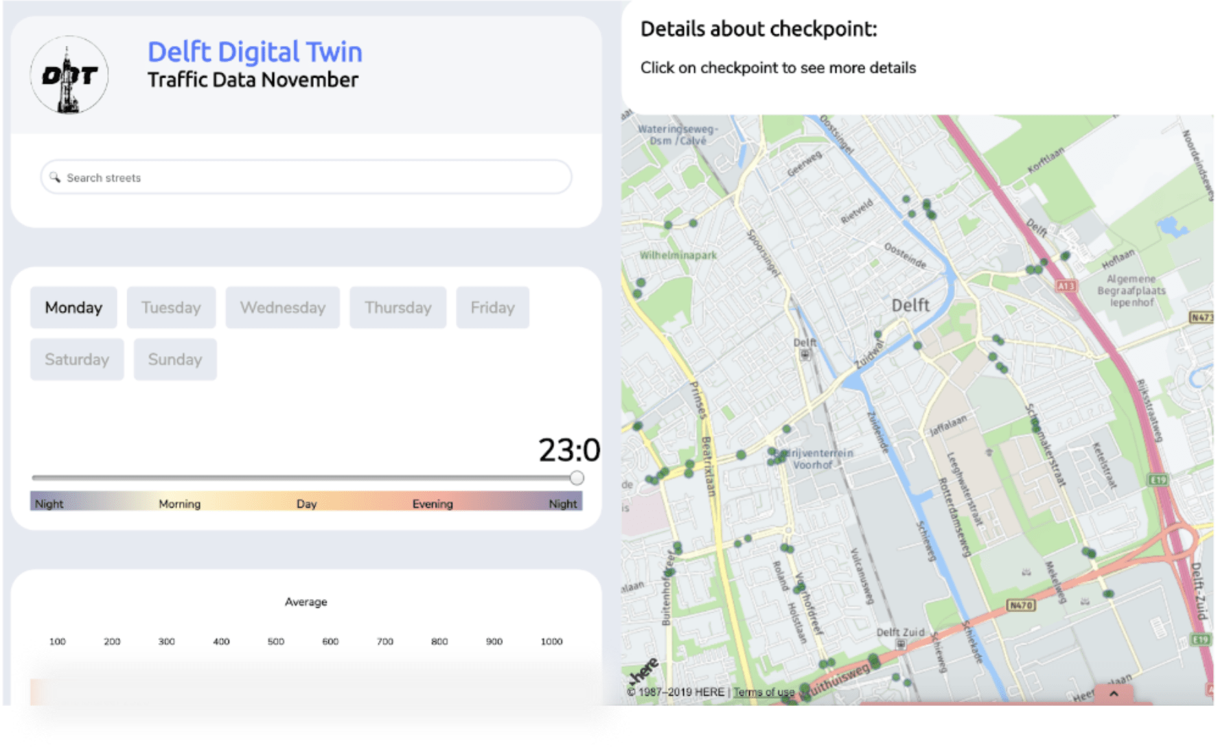
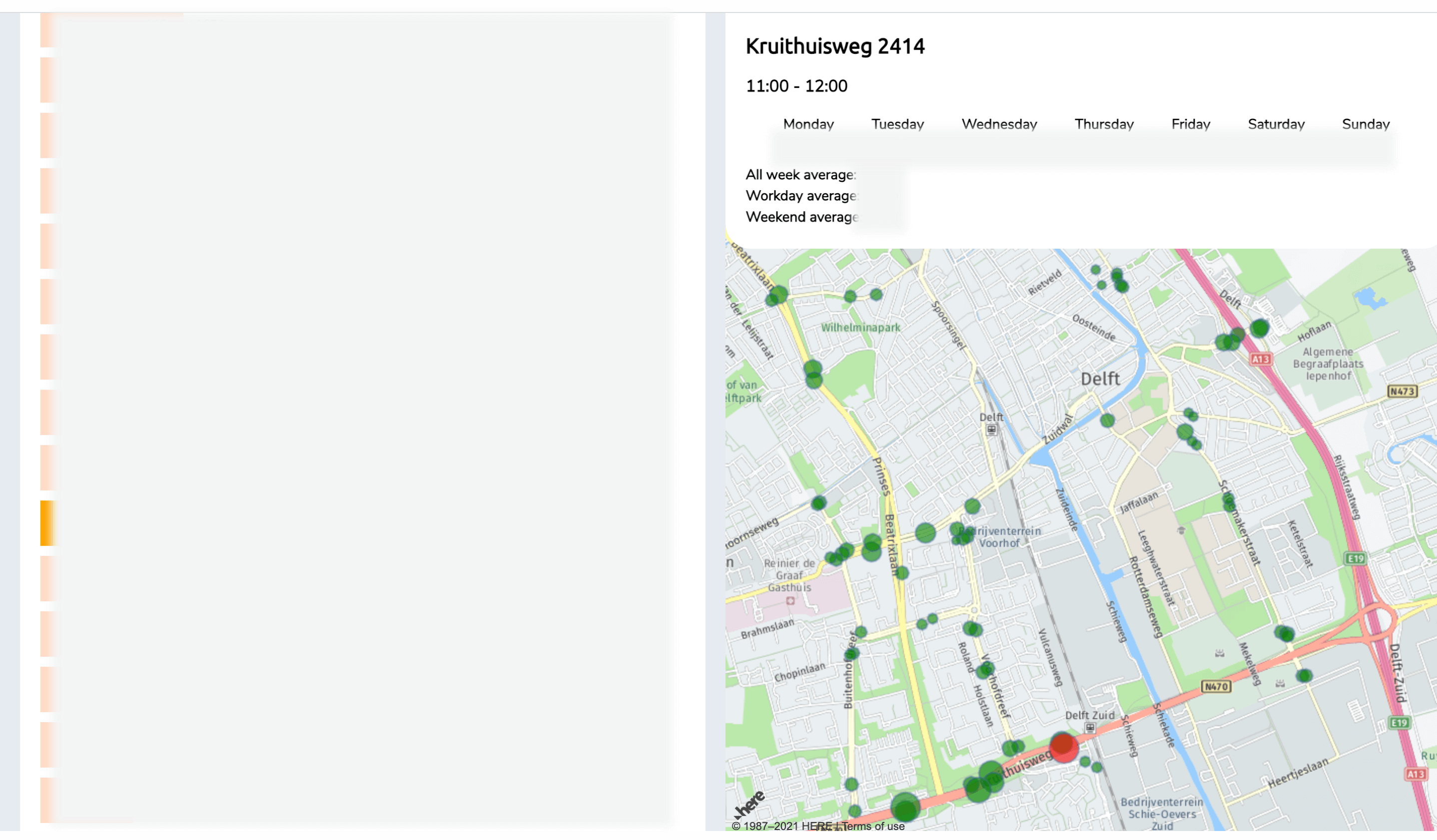
Heatmap results from Hotjar.
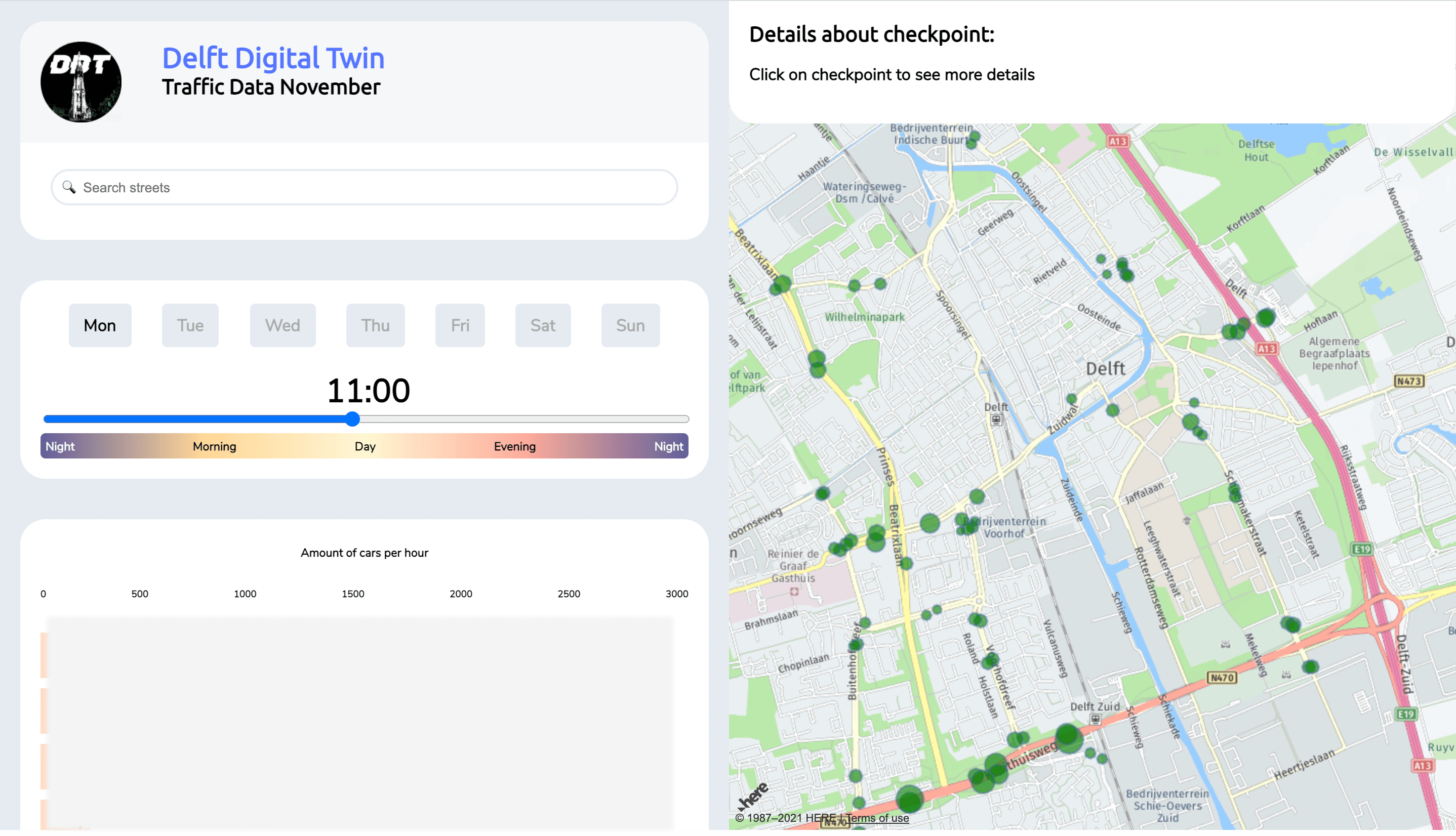
Based on the findings, we improved our product:
- Improved the visual design: added white space, connected the bar visually to its checkpoint and changed the design of the scrollbar.
- Added a legend.
- Added new interactive elements: such as the searchbar and filters.
- Used real data in the map.
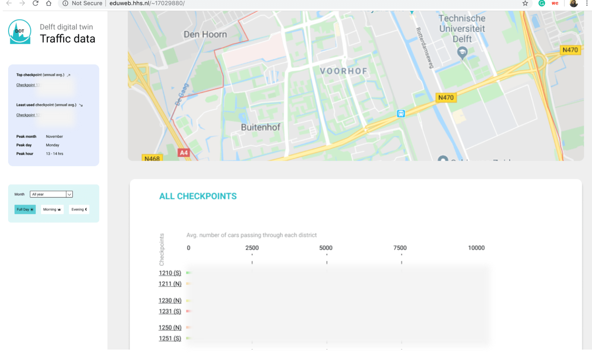
Improved visual design.
The heatmap has a legend.
New interactive elements were added.
The map and graphs use real data.
At the third demo, the clients were really happy about the product. They really liked the fact that we used real data on it. But they also gave us some suggestions:
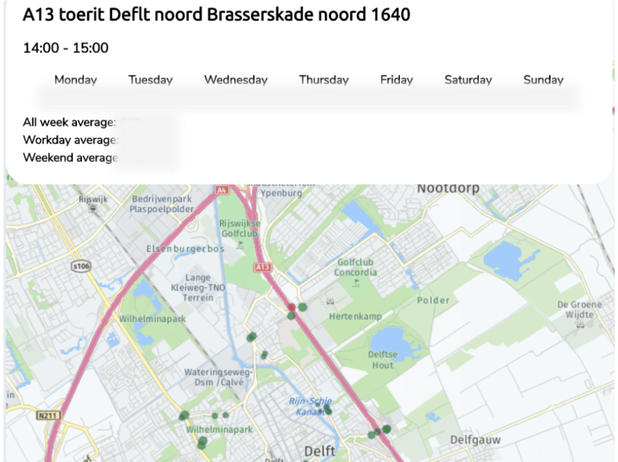
- It would be nice to make the checkpoint change colour according to its capacity (for instance, make it red when its above the average and yellow when is under it).
- Have a date selection.
- Make the graph smaller. The width of the graph should adapt to the maximum value visible.
- Have an hourly graph for each checkpoint.
- Add a slider between the map and the graph.
The solution
The design solution is an easy-to-use and visually appealing platform which fulfills the users needs by providing them with an efficient visualisation of the traffic data.
This platform was showcased in an expo setting at the municipality of Delft. At the expo, 7 other groups presented their final product as well.
Our clients said: