The process
Analysis
For this project I didn't have the opportunity to carry out user research, however I was given a user persona to get a sense of the target group. The target audience were Dutch expats living in the United States. These people enjoy sharing Dutch meals with their loved ones as a way to keep in contact with the Dutch culture. In the American stores they can’t find many Dutch food products and therefore they shop online to get these.
After analysing the user persona, I did an expert review to evaluate the existing website.
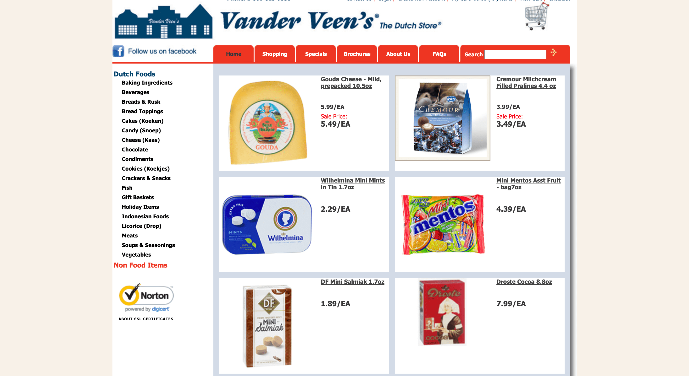
The state of the website's homepage before being redesigned.
The main insights from the expert review were:
- There are no filtering or sorting options to help the user find quickly the right products.
- The images on the website are low-quality, which is something proven to decrease user engagement.
- There is no clear visual hierarchy. Font sizes and colours are used randomly as they don't seem to be following any pattern.
- Web design standards are ignored often. For instance, as for the search icon, instead of the well-known magnifying glass, an arrow pointing to the right is used.
- Irrelevant information to users is displayed, such as a 5-digit code on the product's overview.
Definition
After the expert review, I established the requirements for the redesign and prioritised these with the MoSCoW method. Some of these requirements were:
- Provide users with filtering and sorting options to help them find the right product quickly – MUST
- Include plenty of images and visuals to engage users – MUST
- Follow well known web standards to improve accessibility – MUST
- Include only relevant information to users to avoid distractions – MUST
- Give users the possibility to recover from mistakes, to do and undo – MUST
- Provide clear and descriptive error feedback – MUST
- Display products in a consistent way – SHOULD
- Have a functionality that helps building connections among the registered users – COULD
Conceptualisation
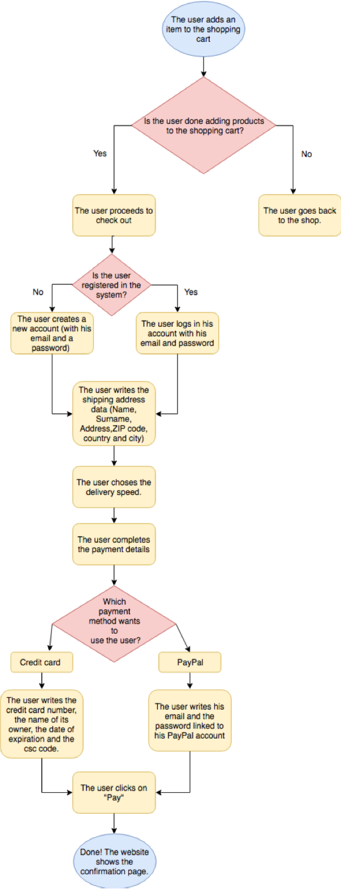
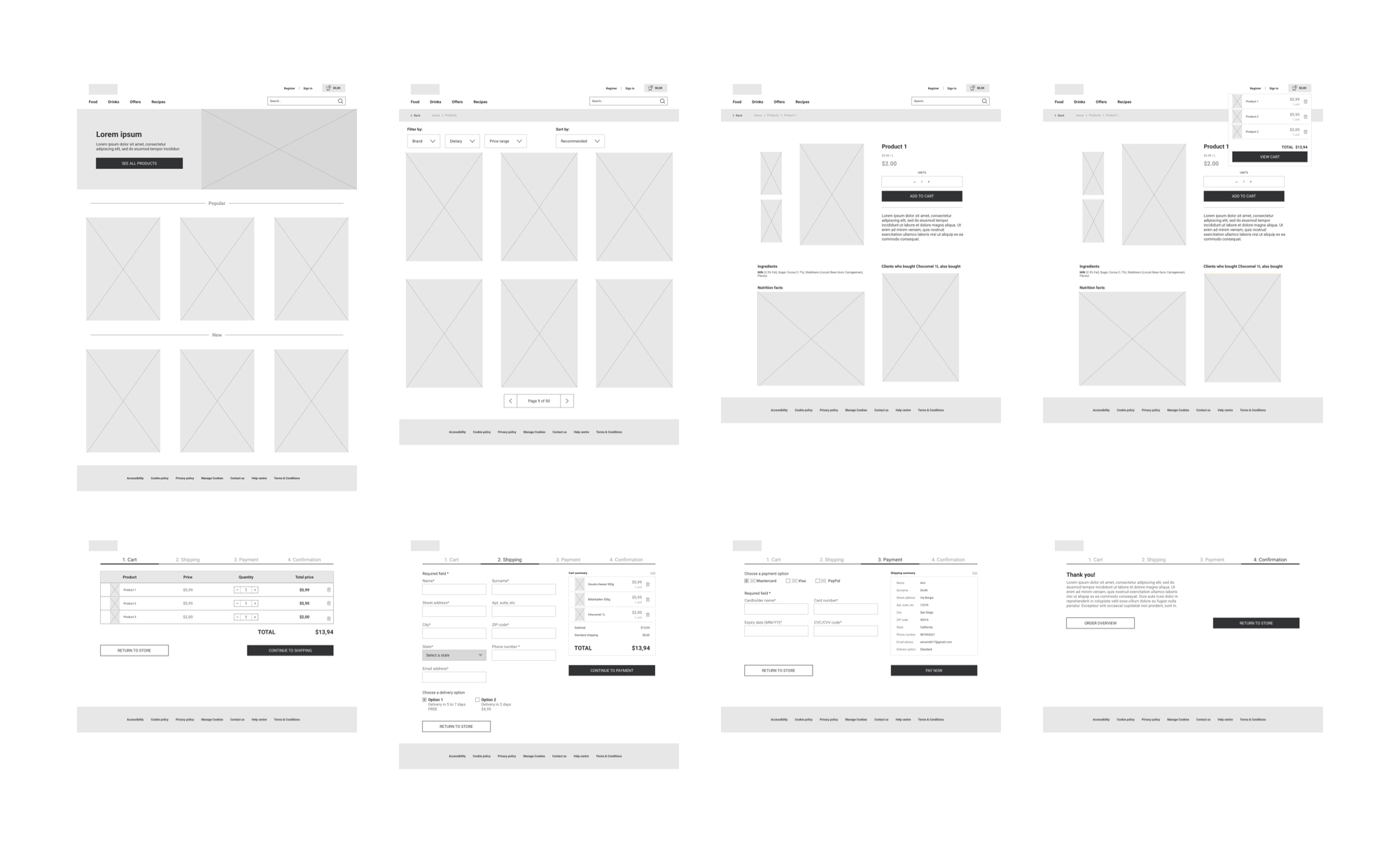
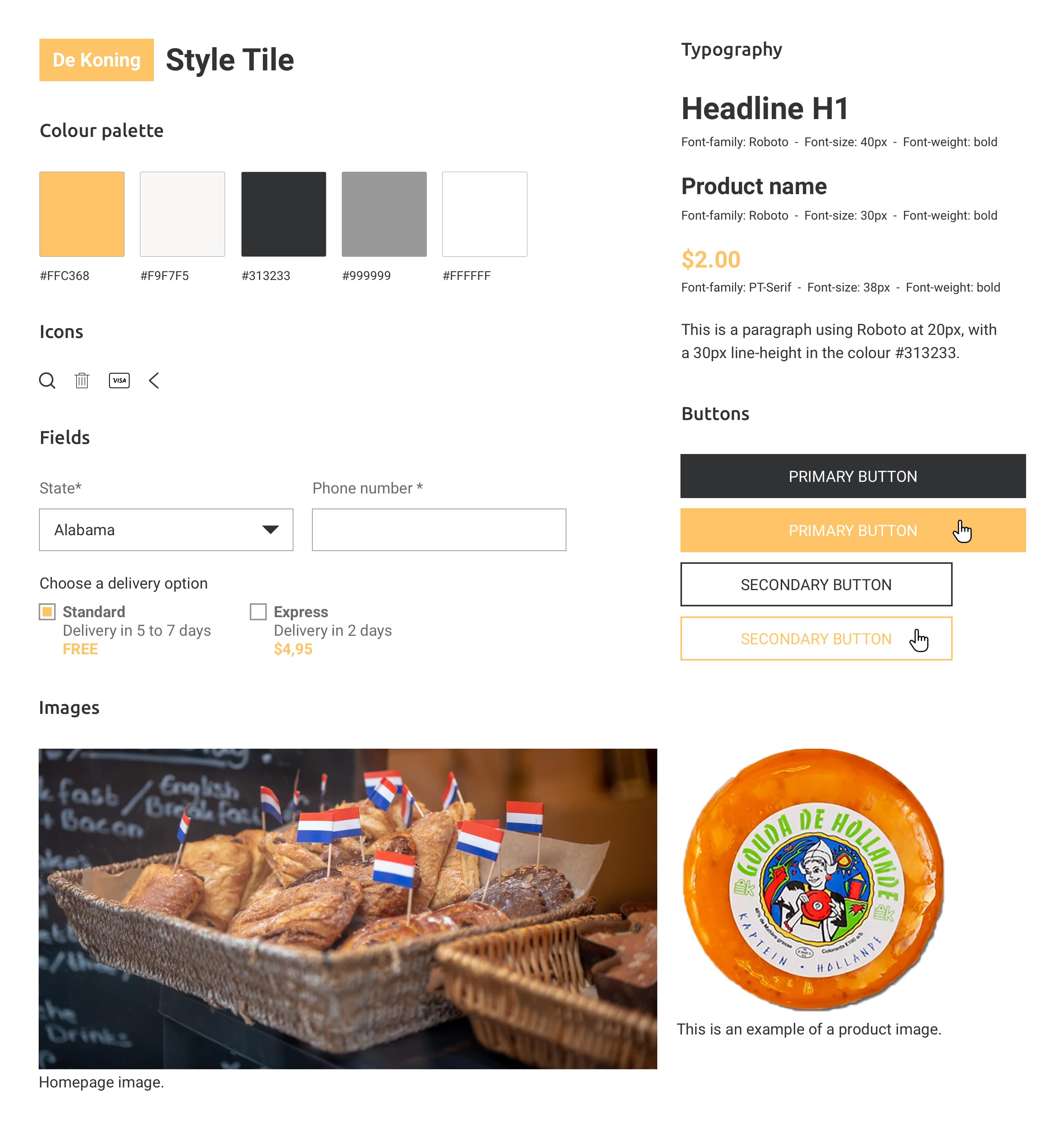
Using the gathered insights and the requirements list, I created a flowchart for the checkout process, the wireframes and a style tile.
Flowchart for the checkout process
Wireframes
Style tile
The solution
The final design consists of a consistent, easy to use and aesthetically pleasing website that fulfils the expectations of the users by offering them an engaging, intuitive and meaningful shopping experience.
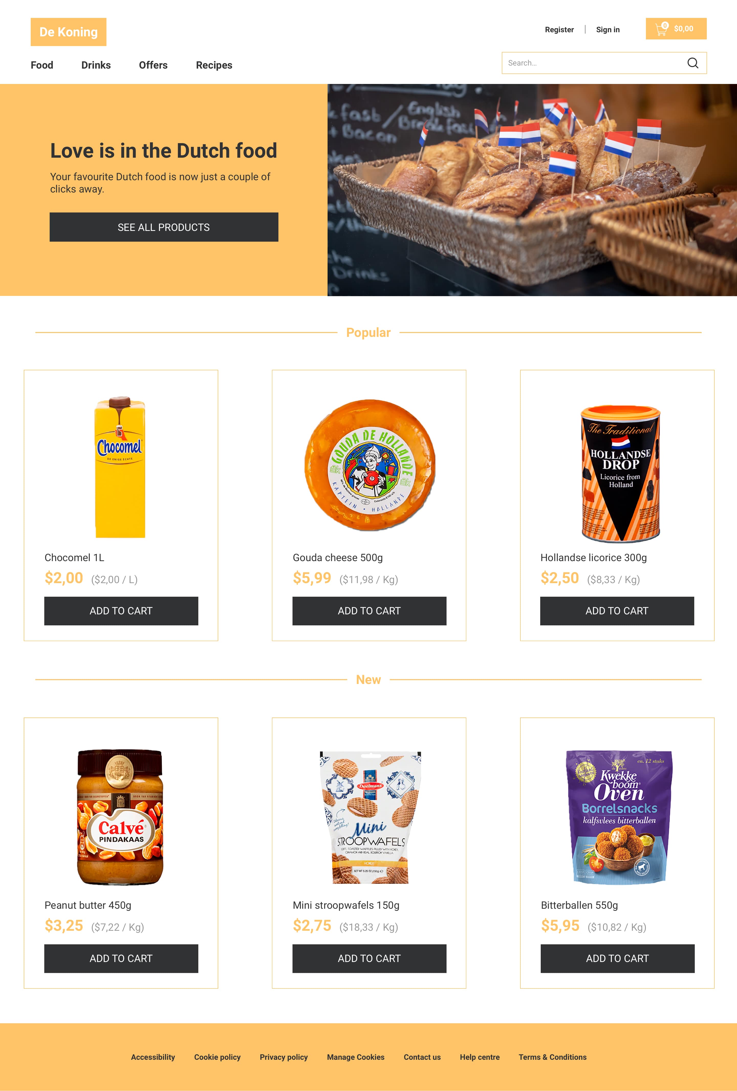
Homepage
The products are displayed using thumbnail grid. In this way, besides creating a strong visual hierarchy, all the products look similar in style and relevance.
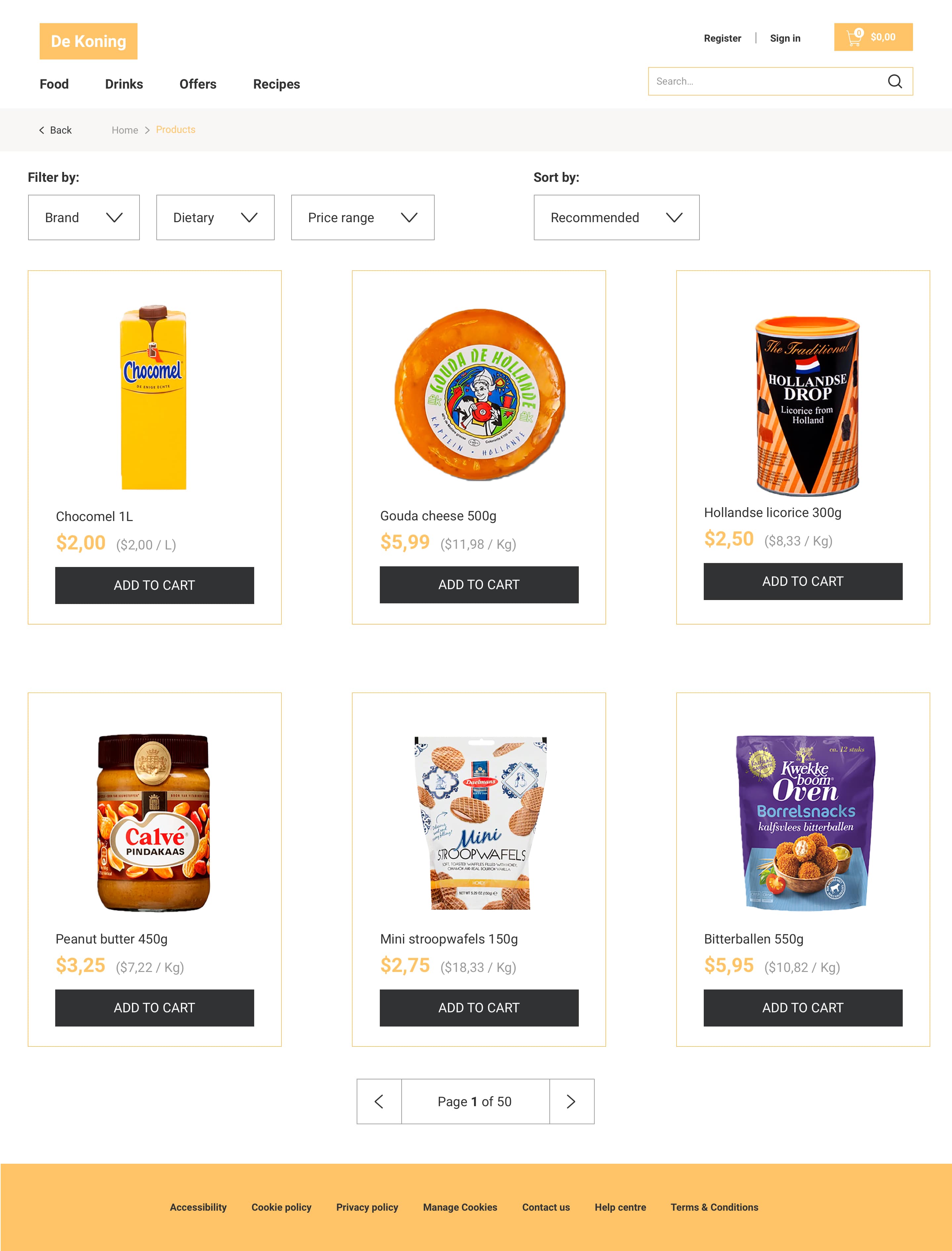
Product overview
In the product overview page, there are a variety of filtering and sorting options which help users quickly find the desired product(s).
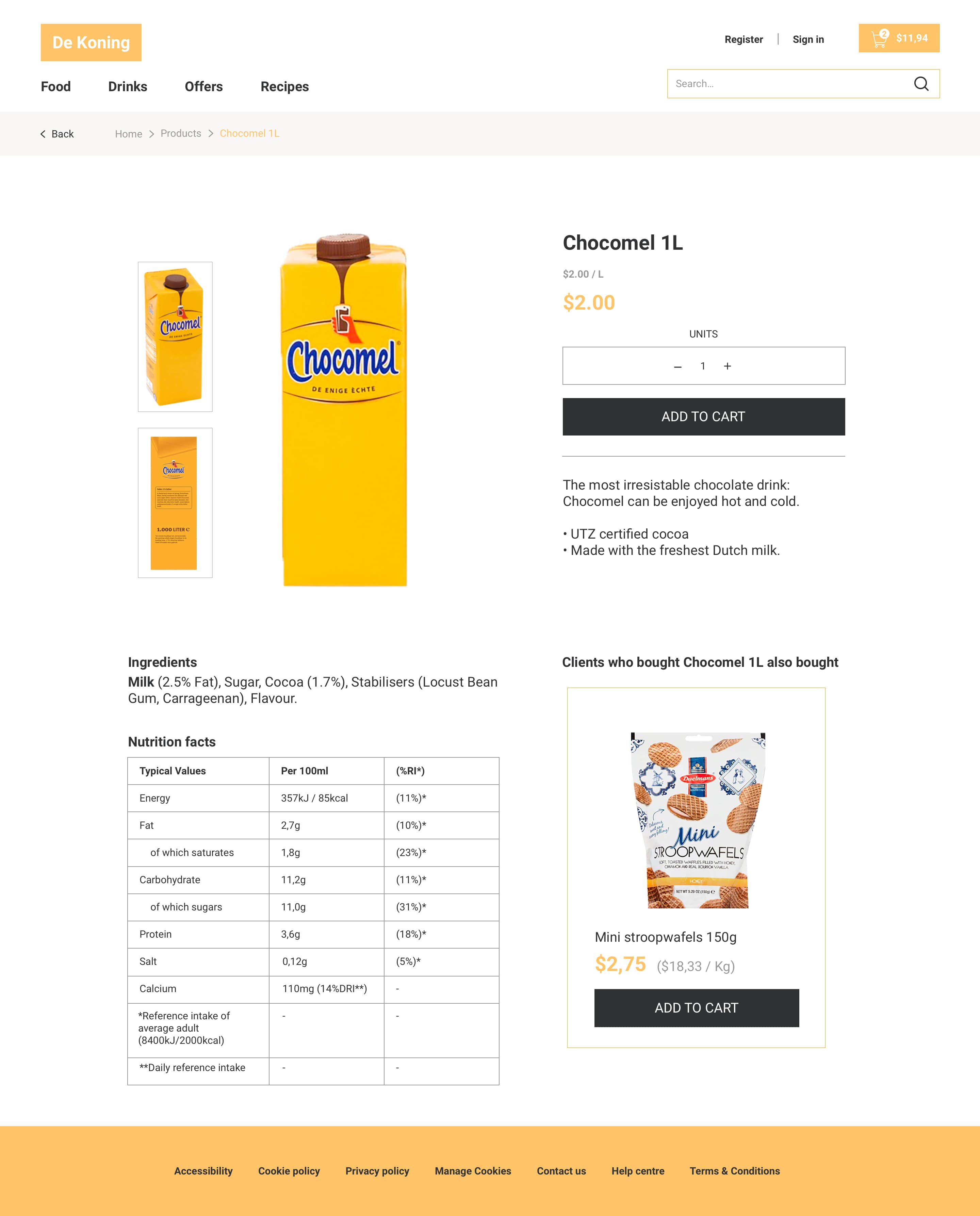
Product detail
In the product detail page, as well as in the other pages of the website, there are plenty of high-quality images to engage users.
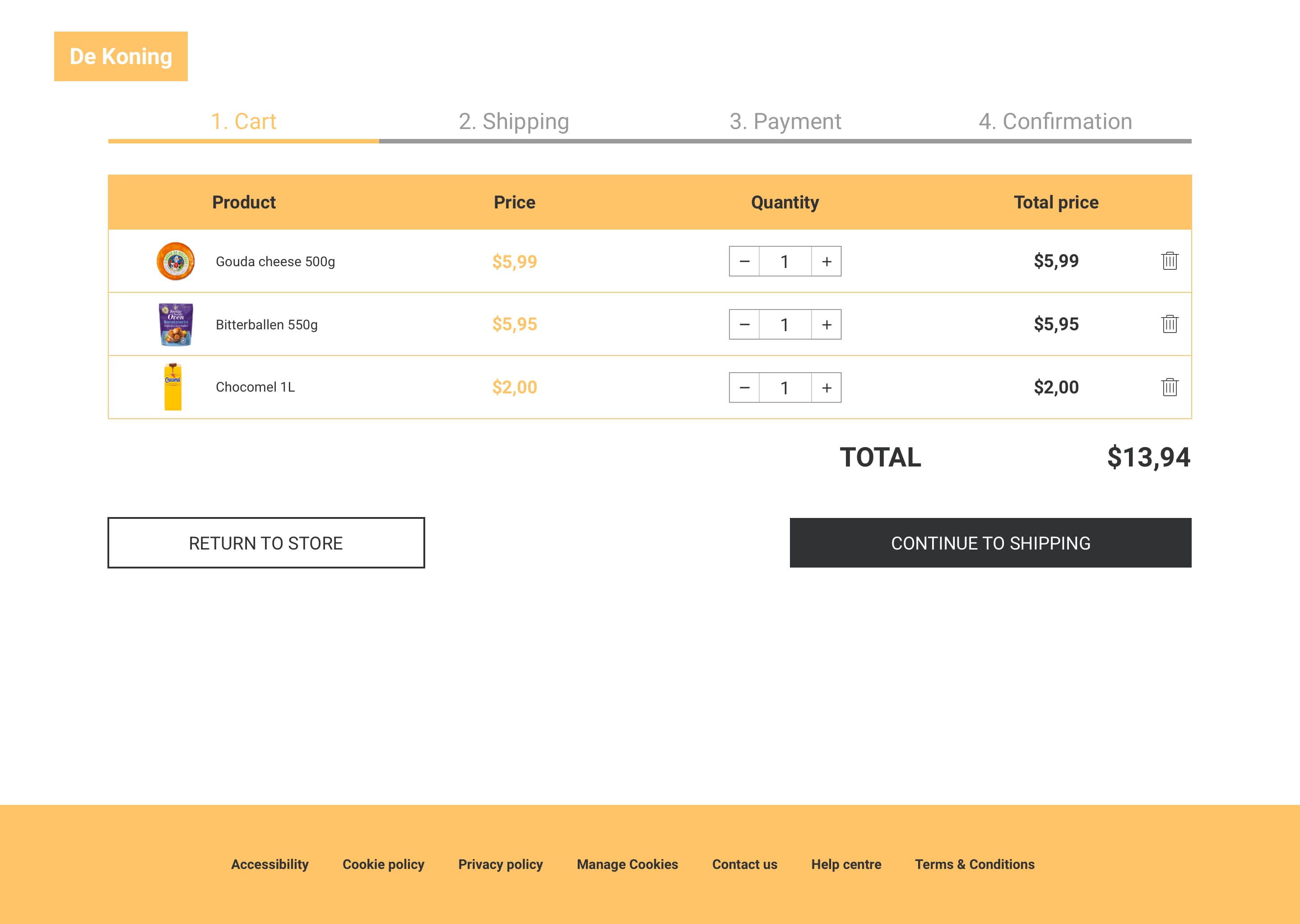
Cart
In the cart page, to avoid distractions, only relevant information to users is included.
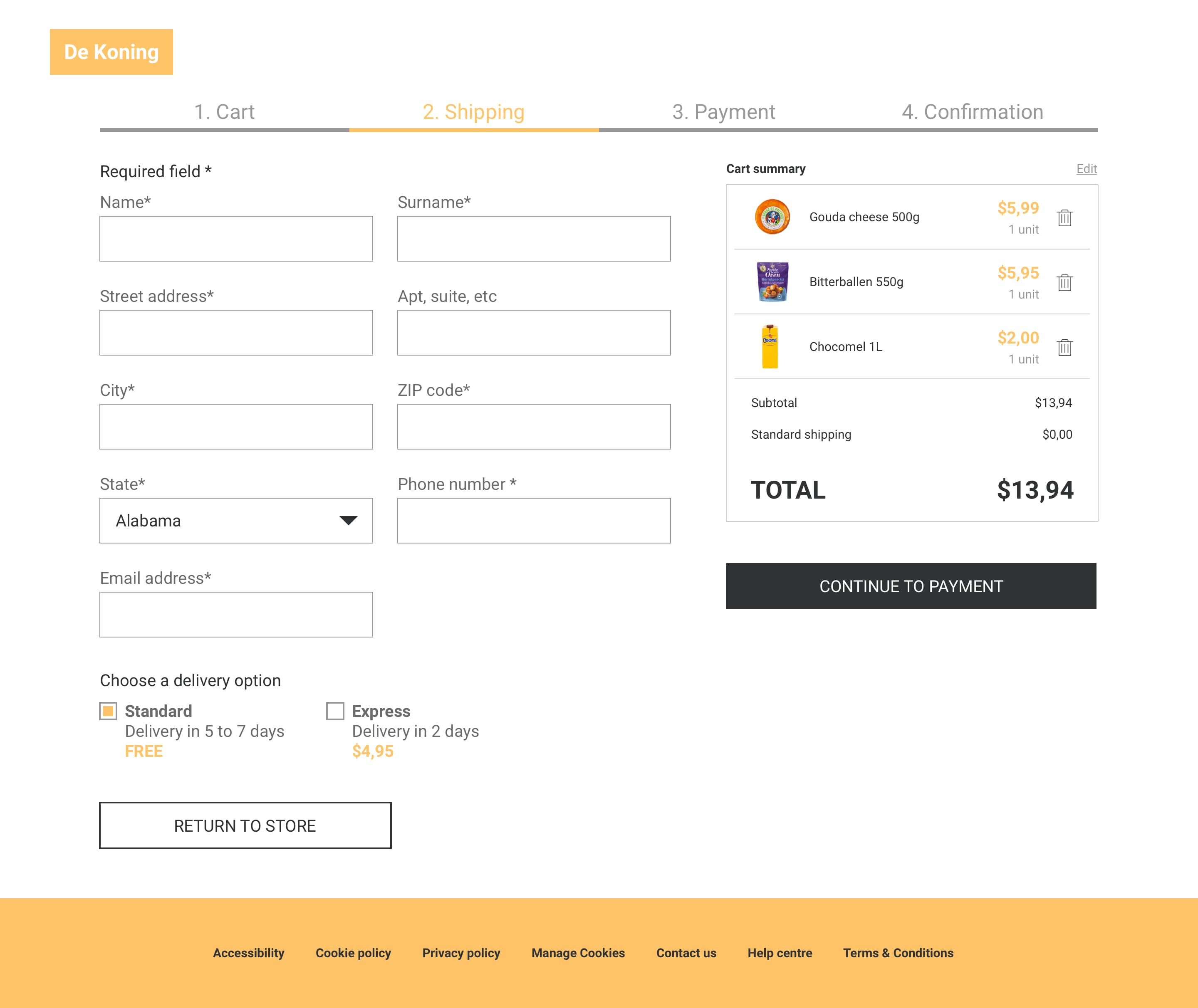
Shipping
While checking out, the users always have the chance to check what they have done in the previous step, which gives them the possibility to back out or correct mistakes.
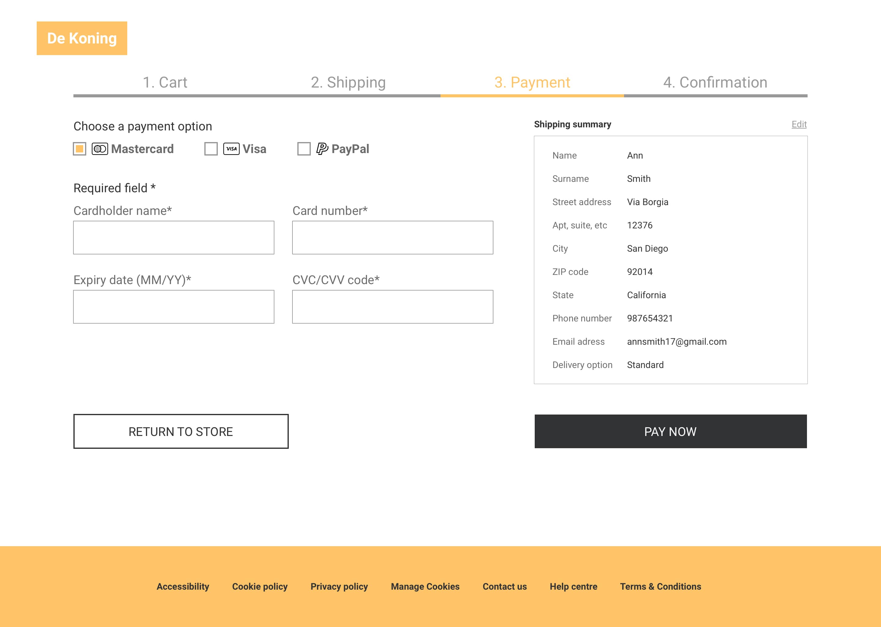
Payment
To give the users feedback on which steps they still need to take in order to complete the checkout process, the progress indicator pattern was used.
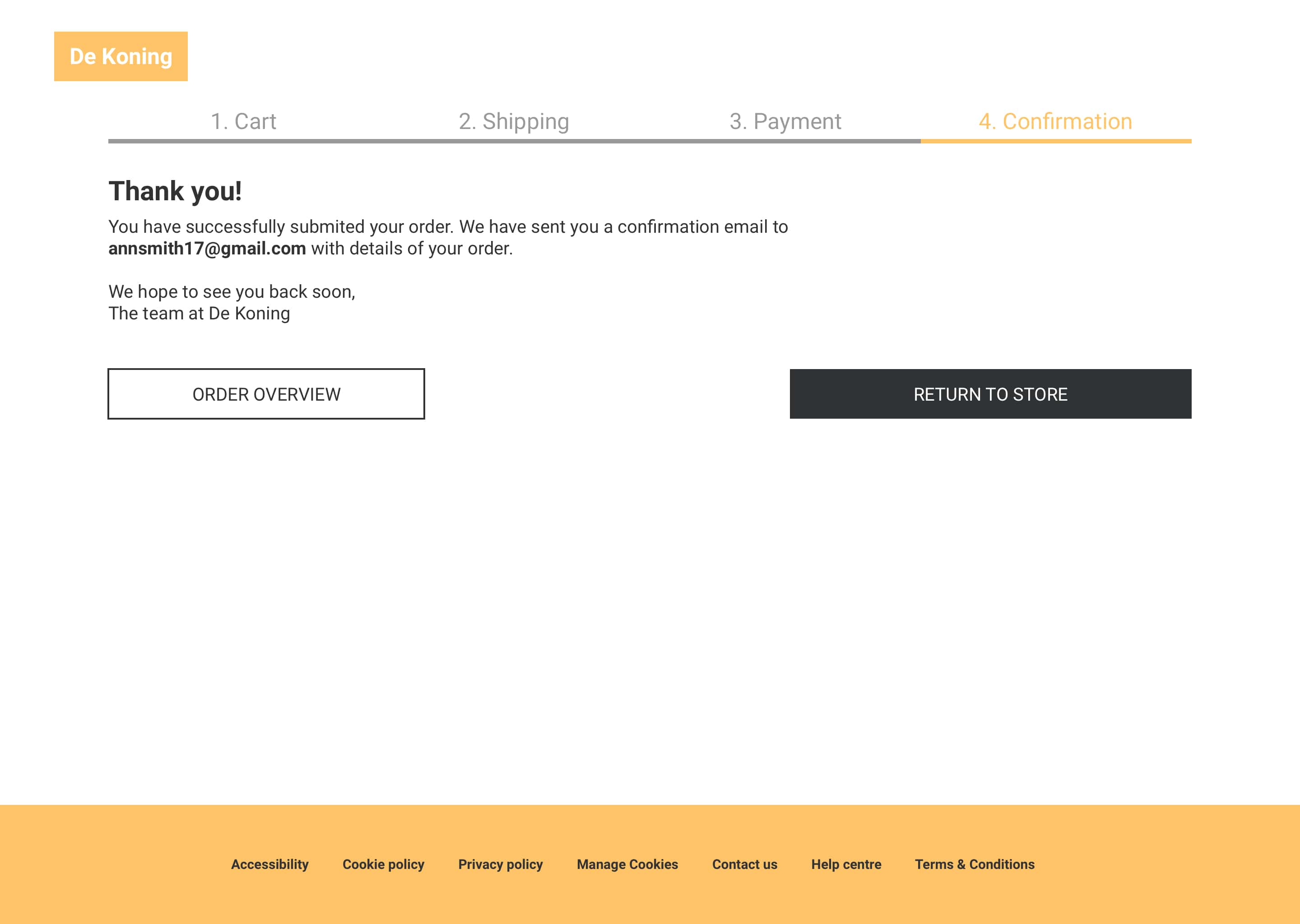
Confirmation
Having a simplified checkout process that requires as little time and effort as possible was a priority in the design. The goal was to create a seamless checkout experience with only a few steps for the user to follow.